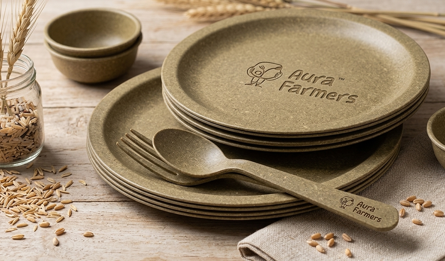
Aura Farmers is a sustainable brand redefining everyday tableware for a new generation. Rooted in a nature-to-nature philosophy, it transforms wheat and rice husk into biodegradable products that feel natural, functional, and culturally relevant.
The brand is built to shift what feels normal. Instead of positioning sustainability as an alternative, Aura Farmers integrates it into everyday moments across gatherings, campuses, and daily routines. It operates at the intersection of agricultural understanding and contemporary culture, creating products that feel current, effortless, and quietly confident.
To create a visual identity for the brand, we focused on reflecting this balance of roots and relevance. The design approach blends playful, organic elements with bold and modern structures, ensuring the brand feels expressive, relatable, and consistent in its presence.
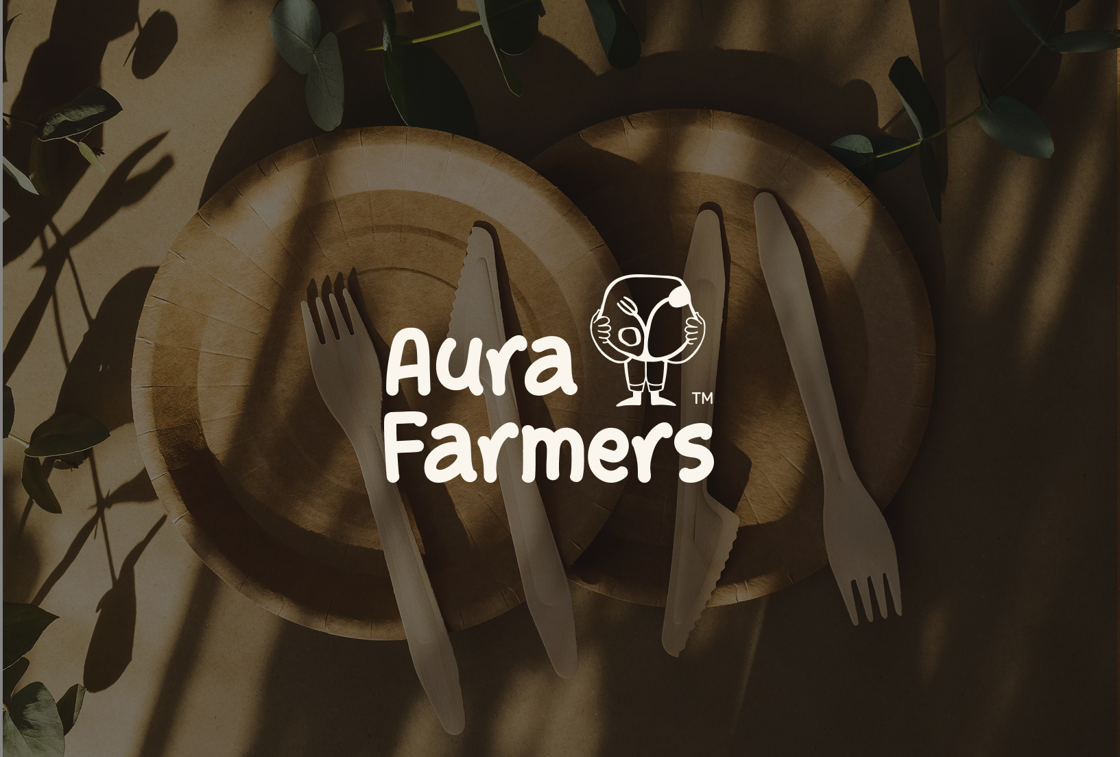
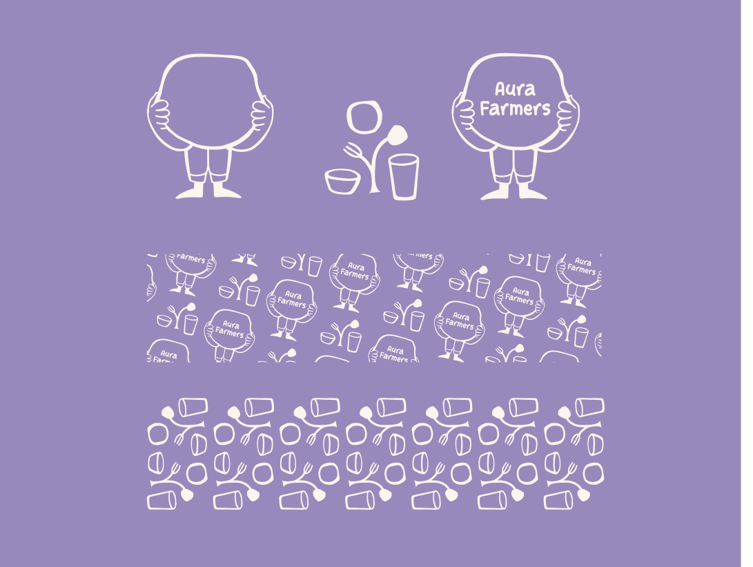
The Aura Farmers logo is designed to reflect the brand’s playful, organic, and culturally aware personality. The mascot-led form brings in a human and approachable feel, while subtly representing conscious dining through elements inspired by everyday tableware.
Paired with bold, soft-edged typography, the logo balances sustainability with a modern and youthful energy. The design ensures strong recall while maintaining a sense of ease, making the brand feel natural, expressive, and instantly recognisable.
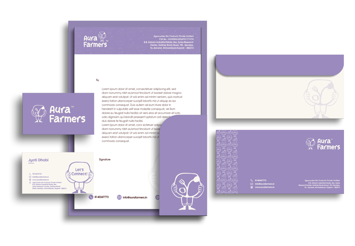
Allowing ample space around the Logo and Wordmark is essential for a clean and uncluttered appearance. This enhances their visibility and reinforces the brand’s identity.
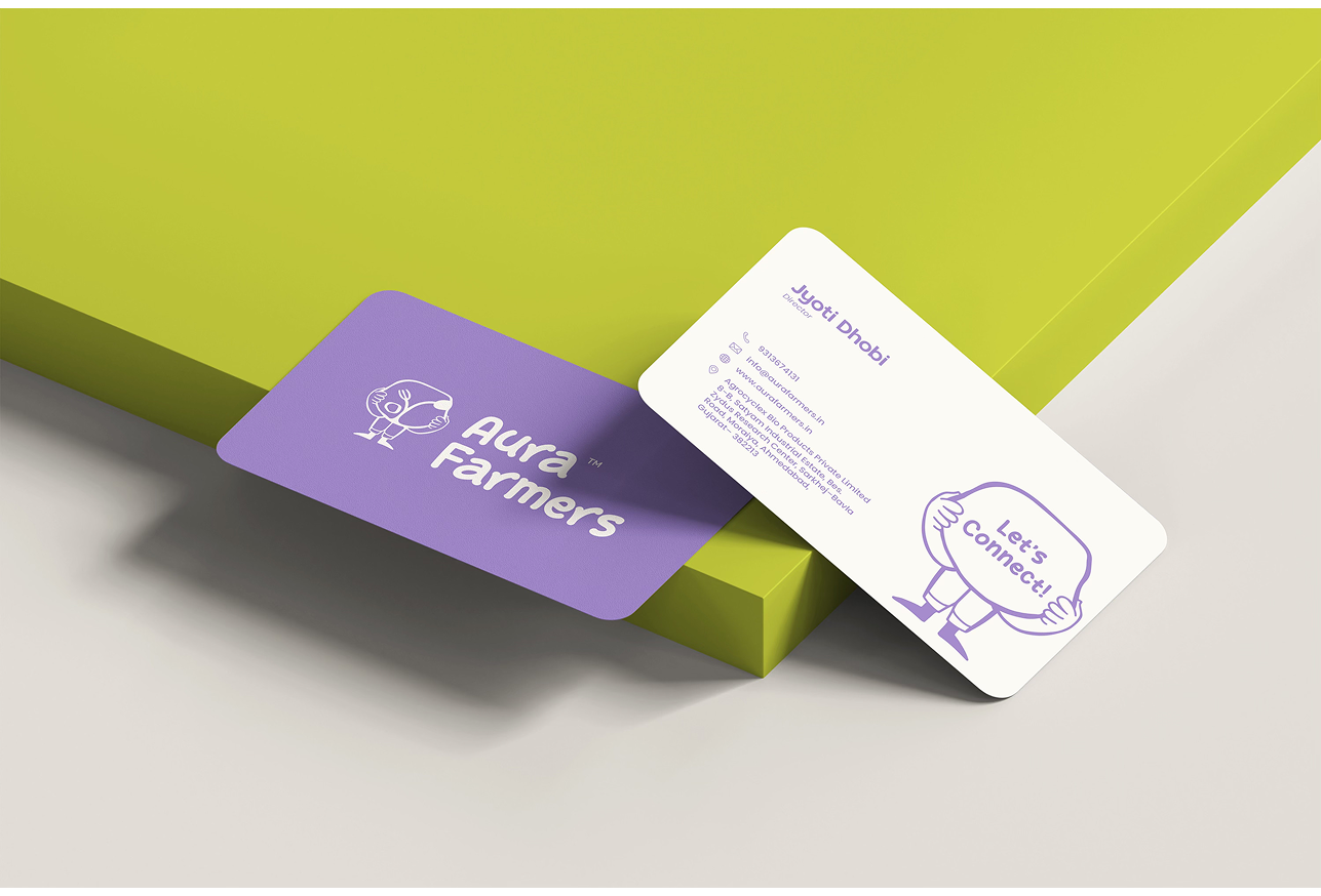
These are logo variations that play a role in a brand’s visual identity and brand recall value. They position a brand as distinct and recognizable across all touchpoints while making it look cohesive and established.
Tango Sans is a bold and contemporary typeface that brings strong character and visual impact to the brand. Its confident and refined forms make it ideal for headings, helping establish a clear and modern identity.
Poppins is a clean and geometric typeface chosen for its high readability and balanced structure. It supports the brand with clarity and consistency, making it suitable for body text across different applications.
Start Story is a playful and rounded typeface that adds warmth and personality to the brand. It is used for accents and short highlights, bringing a friendly and expressive touch to the overall visual language.


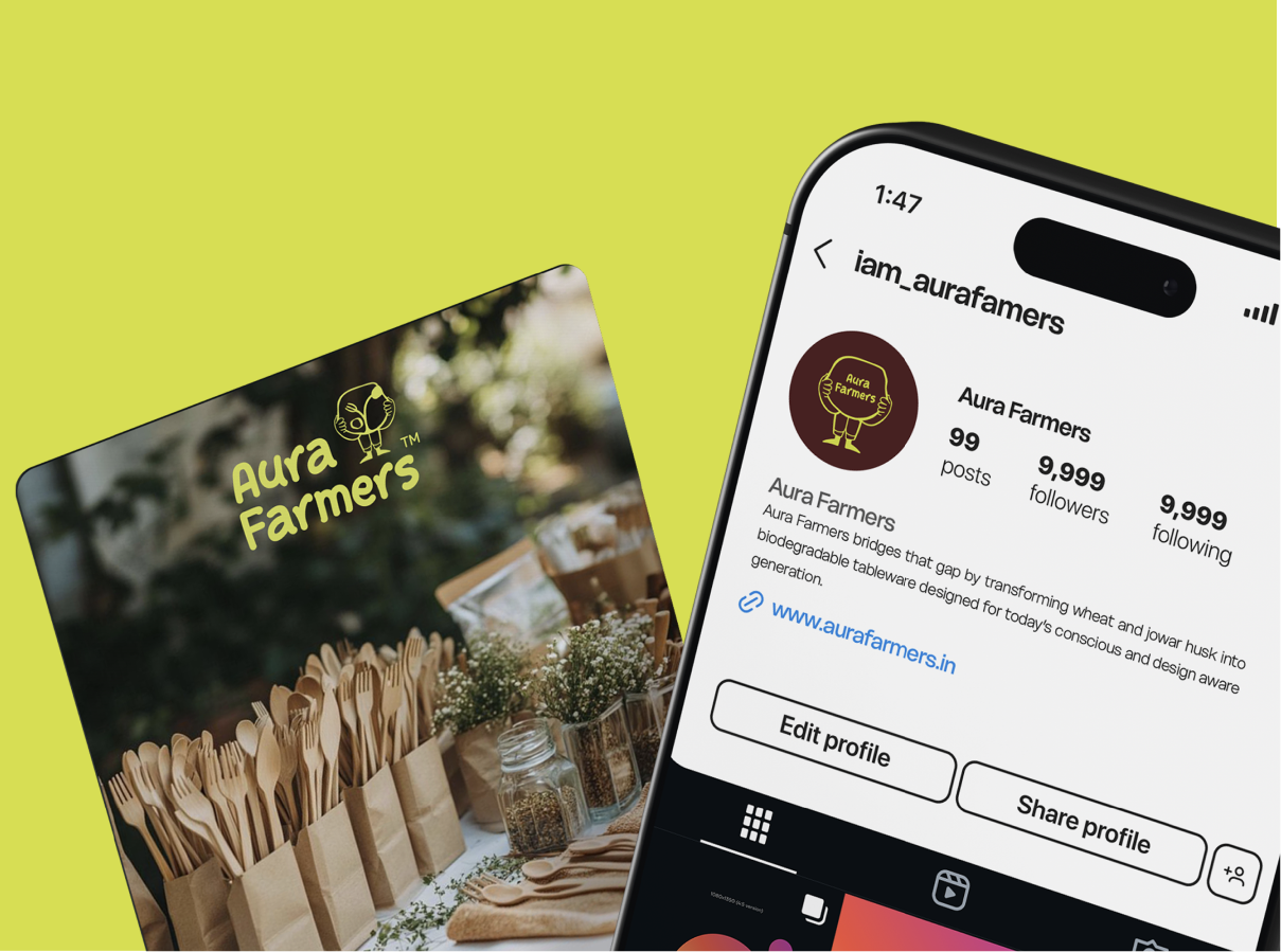
To establish a brand’s visual identity, we conduct thorough research on its industry and target audience. Based on this research, we craft some social media post mockups that demonstrate the ideal logo placement for the brand for maximum visibility and effectiveness. Positioning the logo in this layout ensures a creative flow and consistency across the brand’s social media presence. This approach enhances both the overall brand value and user experience.